

Case Study
I rebuilt Vedantu's profile, wallet and payments
across app and web.
Vedantu’s profile let users save data that was quietly impossible - breaking the personalization the whole product runs on. I rebuilt the profile, and designed the wallet and purchases flows that hang off it, so the structure itself couldn’t store a contradiction.
- My Role
- Product Designer
- Platforms
- App & Website
- Scope
- My Profile
- Year
- 2024

Vedantu · App & Web · 2024
ONE PROFILE,
THREE JOBS

the same data, finally in one place
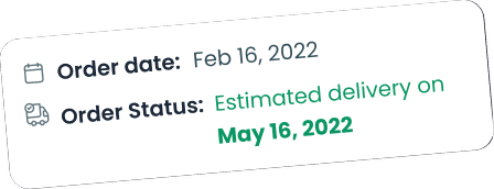
Impact
What it set out to moveNumbers
0 impossible
invalid Grade - Board - Target combinations can be saved - by design
3 → 1
fragmented platforms (Dweb / Mweb / App) unified into one synced source of truth
+ pay
payment touchpoint added to App & Mweb profiles via Purchases & Wallet
↓ drop
profile-update drop-off targeted by cutting mandatory fields to signup-only
The Problem
Asettings pagewas silently breaking the product.
On paper, My Profile was where you edit your name. In practice it had become a liability with three compounding failures:
1 · It stored contradictions.
Users could change Grade, Board and Target independently of one another - so the system happily saved combinations that can’t exist. Vedantu personalizes course discovery and recommendations off that exact data; broken combinations meant broken personalization, and weaker upsell.
2 · It hid the money.
On App and Mweb there was no entry point to Wallet or Purchases - students and parents literally couldn’t see or pay pending course fees from their profile. Revenue, blocked behind a missing button.
3 · It disagreed with itself.
Dweb, Mweb and App showed different data, and the update flow was complex enough that people started editing and dropped off.
The brief wasn’t “make the profile prettier.” It was “make the profile trustworthy - to the user, to the business, and to itself.”
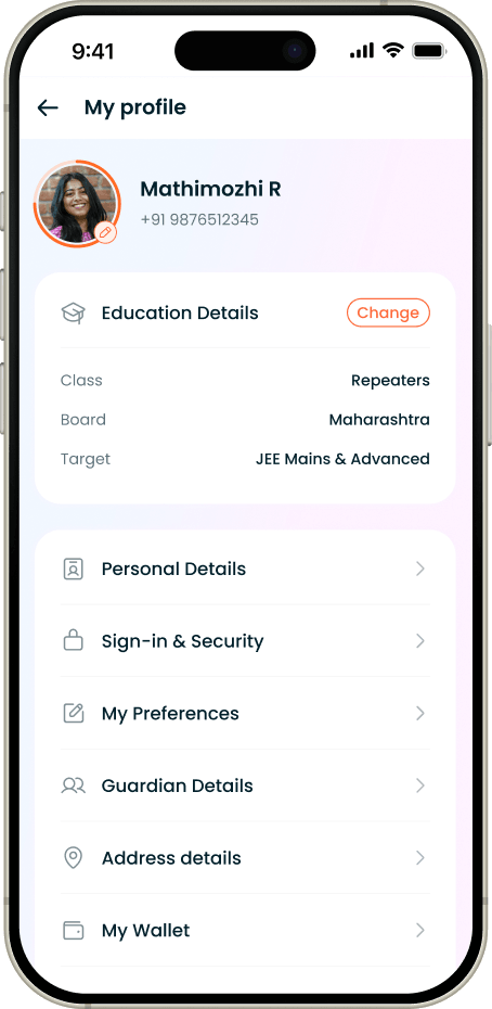
Old - Profile Page
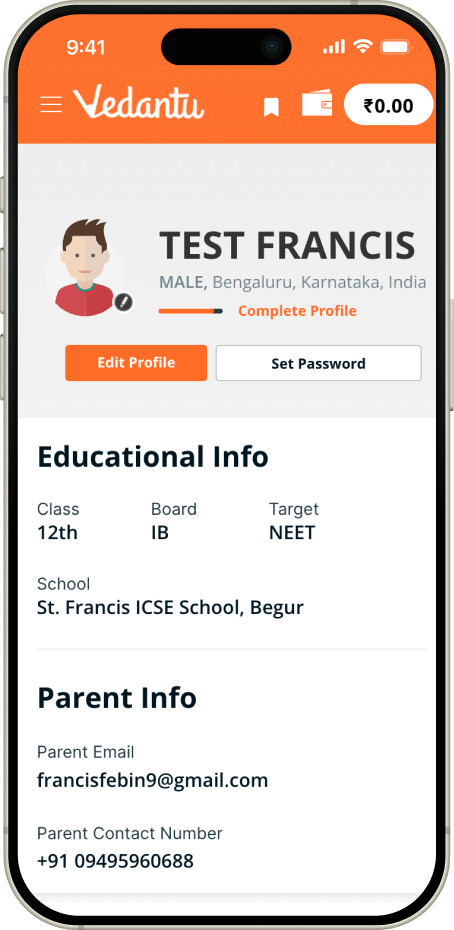
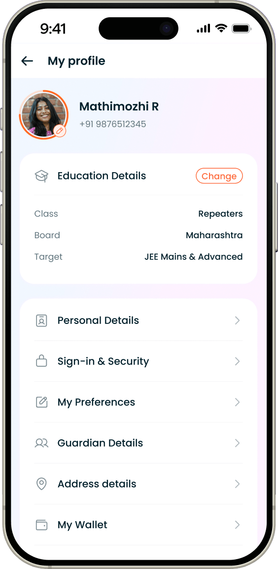
New - Profile Page
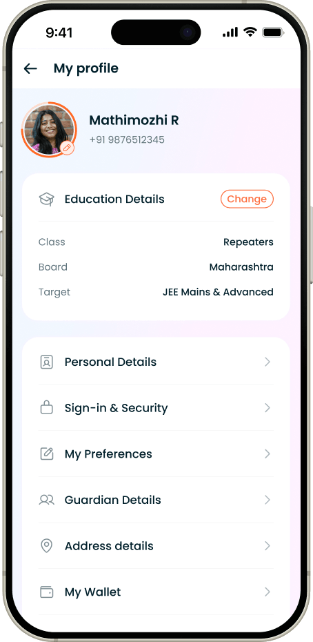
Old - Profile Page
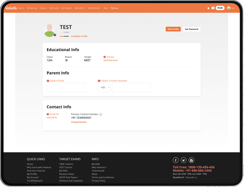
New - Profile Page
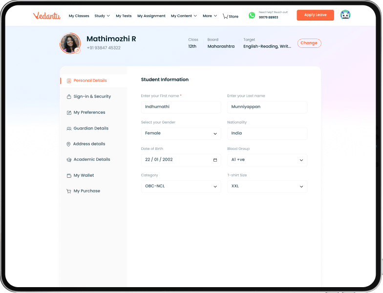
The Core Decision
Make thecontradictionimpossible to save.
The old flow treated Grade, Board and Target as three free fields. The fix wasn’t validation bolted on top - it was making the fields dependent by structure, sourced from a single signup repository, behind a deliberate 3-step confirmation so the user re-commits to a coherent goal as a set, not a scatter of edits.
Before - independent edits & impossible combinations
After - dependent, repository-driven & 3-step confirm
Each selection narrows the next from the signup repository - so an invalid GBT set is unreachable, not just discouraged. Existing users get a non-skippable confirm popup to clean their data once.
I didn’t validate against bad data. I designed a structure where bad data has nowhere to live.
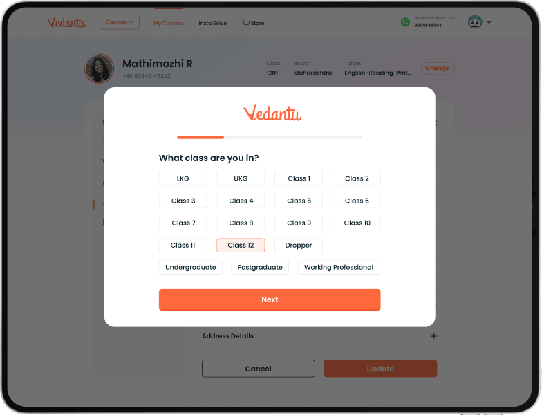
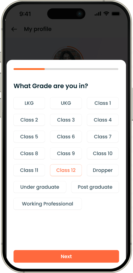
Grade first. LKG through Working Professional; progress bar at 25%, CTA Next.
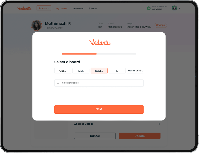
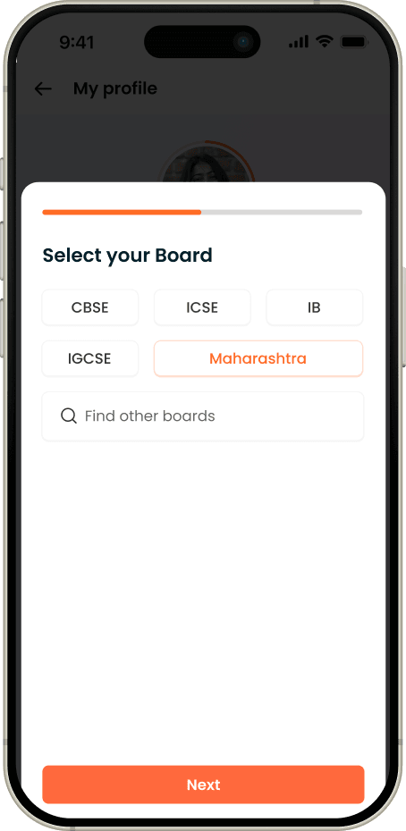
Boards narrowed by the grade chosen, plus a Find other boards search. 50%.
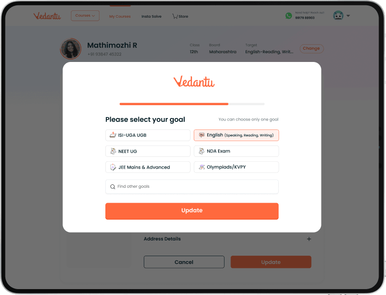
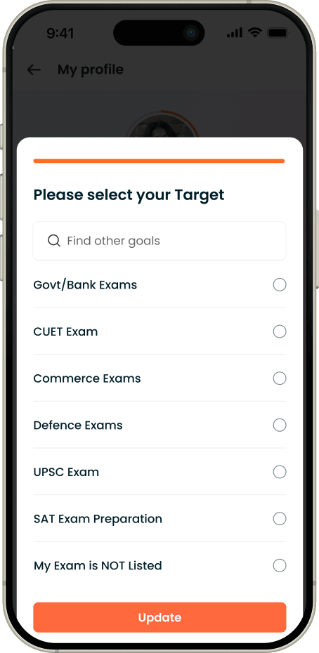
One goal only, sourced from the repository. 75%, CTA becomes Update - this is where the set commits.
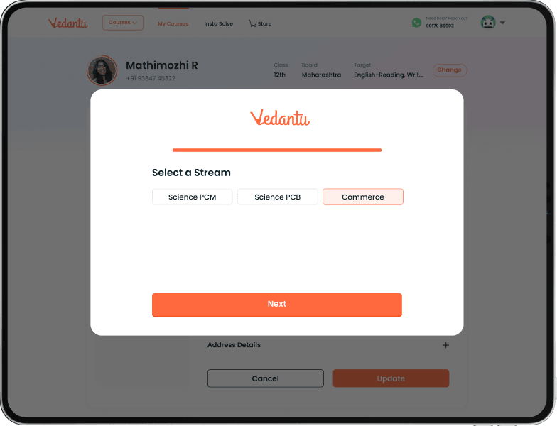
Conditional fourth step (PCM / PCB / Commerce) for Class 11–12 on school preparation. Bar completes.
Decision Stories
Four decisionsthat rebuilt trust in the profile.
A case study is a record of decisions. These are weighted the way the work was: data integrity first, then the unblocked payment path, then the judgment calls that lowered friction.
Decision 01 - Strategic / Systems · data integrity
Treating the profile as a source of truth, not a form
The tension :
The business needed coherent Grade–Board–Target data to personalize the product - but the profile let users edit each independently, manufacturing impossible combinations and corrupting the very data personalization depends on.
Why it mattered :
Course discovery, recommendations and upsell all read from GBT. Bad combinations didn’t just look wrong - they quietly degraded every personalized surface downstream.
The turn :
I made GBT dependent by design: each choice sources its valid options from the signup repository and narrows the next, wrapped in a 3-step confirmation. An invalid combination isn’t rejected after the fact - it’s unreachable. Existing users clean their data once via a non-skippable confirm. Stream is only requested for Class 11–12 users targeting school preparation.
Decision 02 - Strategic · revenue unblock
Putting the payment where the user already was
The tension :
App and Mweb profiles had no entry point to Wallet or Purchases. A user with a pending course payment had no way to see or settle it from where they naturally looked - their profile.
Why it mattered :
The pending fee was real revenue sitting behind a missing button. The profile was the most natural place to surface it, but it didn’t.
The turn :
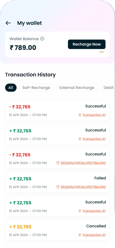
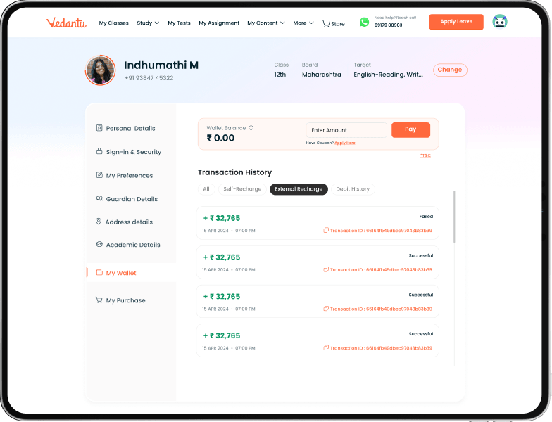
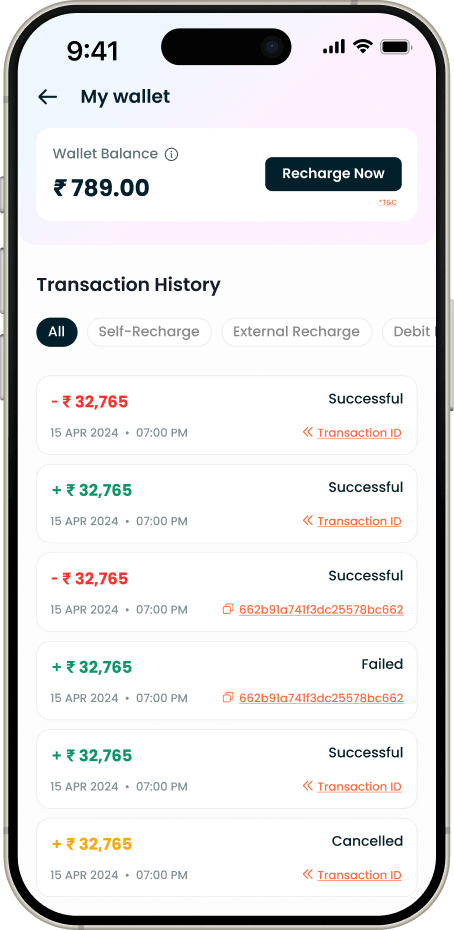
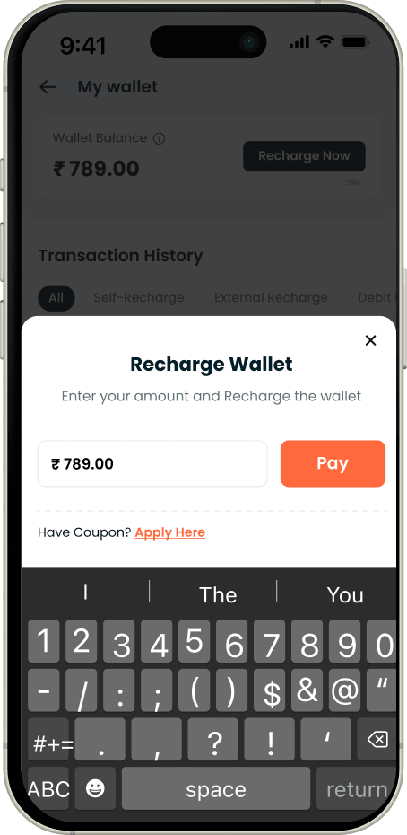
I designed Wallet and Purchases as first-class profile destinations on App & Mweb. In My Purchases, inactive (unpaid) courses show a clear “Pay now” CTA routing to the payment page, while active courses show a non-clickable “Paid” state. In My Wallet, I designed recharge (₹100–₹2,00,000), coupon apply, and the Session / Order / Recharge / Invoice history sub-sections.
My purchase
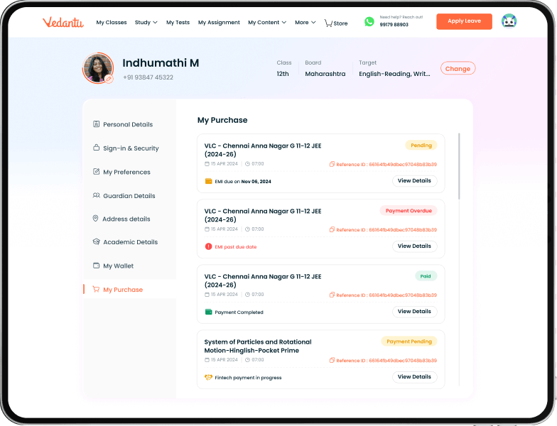
New - Profile Page
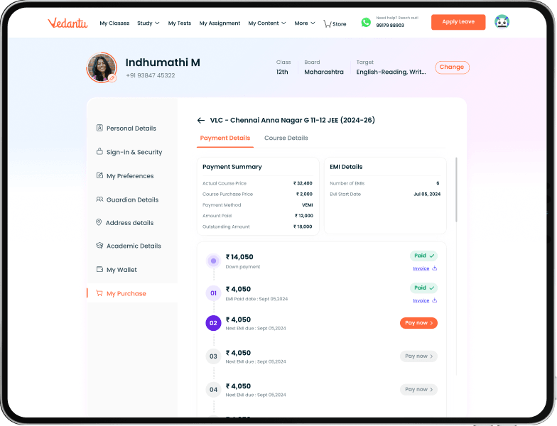
My Wallet
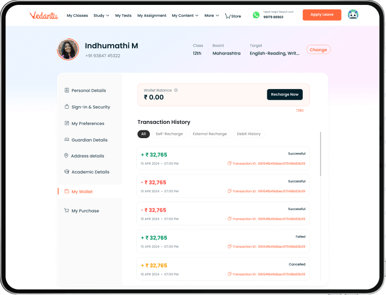
Rechrage wallet
Decision 03 - Systems · consistency
One profile, three platforms, instant sync
The tension :
Dweb, Mweb and App each showed and stored profile data differently - so the same user saw different things, and edits in one place didn’t reach the others.
Why it mattered :
Inconsistency is its own trust problem: a user who sees stale data stops believing any of it, and stops editing.
The turn :
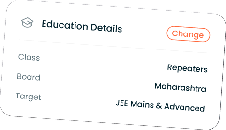
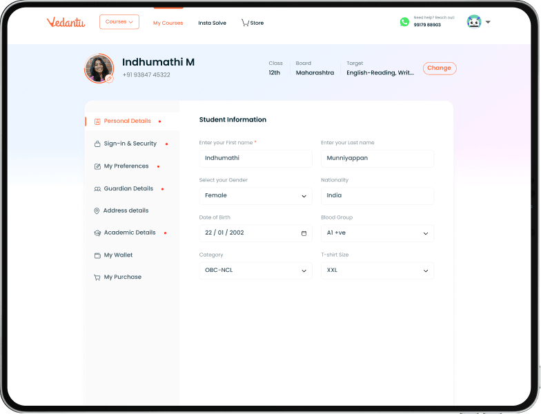
I designed one structure and content model for all three, with immediate cross-platform sync - edit on web, it’s live on app and vice versa - plus a persistent education-details header so the user’s core identity is always visible regardless of section.
Decision 04 - Tactical · friction & judgment
Asking for less, so people finish
The tension :
The old profile treated fields like Guardian, Address and Language as mandatory - adding friction and feeding the drop-off the revamp was meant to cut.
Why it mattered :
Every mandatory field is a place to abandon. But loosening rules can’t mean losing the hard safety states underneath.
The turn :
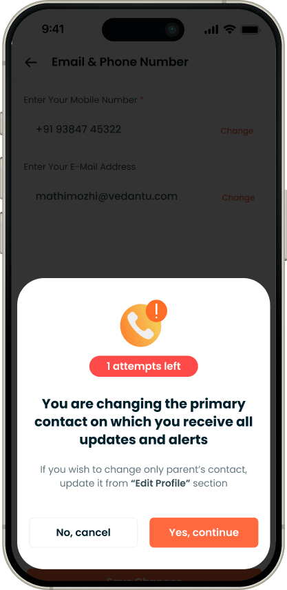
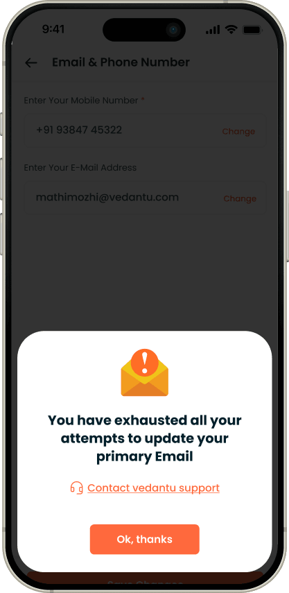
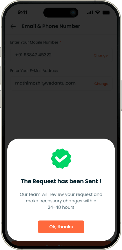
I made only the signup fields mandatory and everything else optional - while still designing the harder states underneath: OTP verification for changing student or guardian phone numbers, single-attempt limits with a contact-support fallback on sensitive fields (name / phone / email), and an “changes are not saved” toast so edits are never lost silently. Up to 2 guardians, with Guardian 1 non-removable.
Old - Profile Page
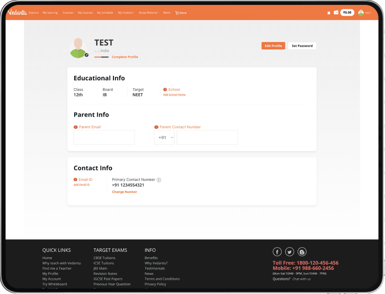
New - Profile Page
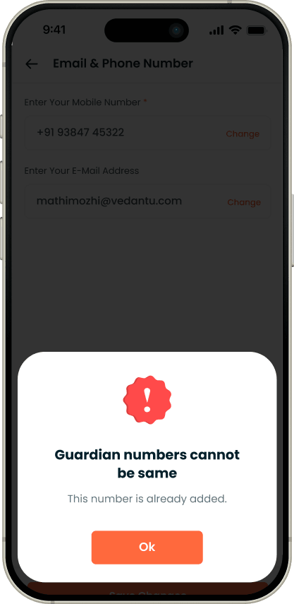
Error States
The Solution, as a Structure
From a flat settings list to anavigable system.
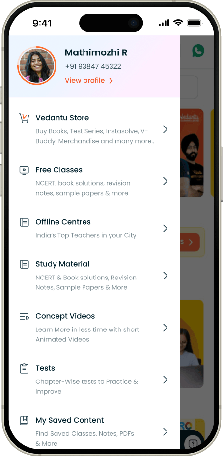
A hamburger menu reachable from any logged-in page; a persistent education-details header; and sub-sections that let users move between Profile, Wallet, Purchases and Bookmarks without diving back into the menu each time.
Menu / nav
Reachable from any logged-in page, with name & contact in the header.
Menu Side bar
Profile
Personal · email & phone · guardian · address · preferences.
Profile Page
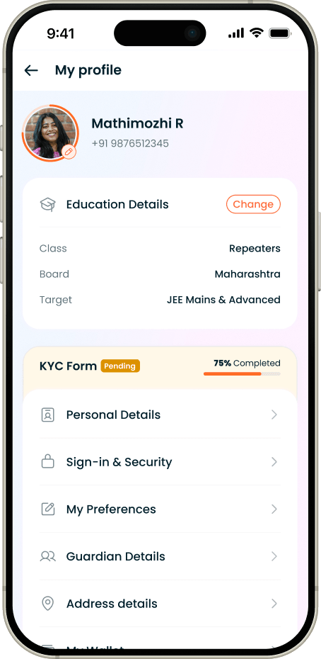
KYC - Profile Page
Wallet / Purchases
3-step dependent confirmation, repository-sourced.
My purchase
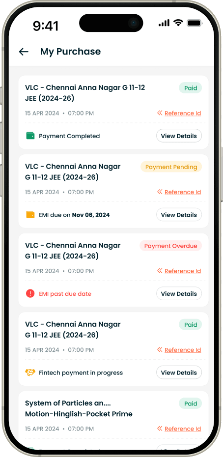
Payment Detail - Bundle
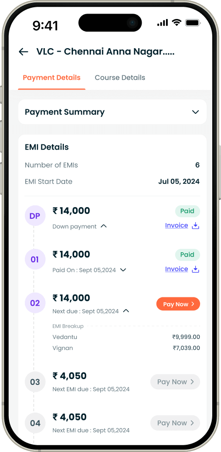
Payment Detail - Bundle
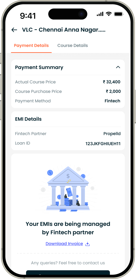
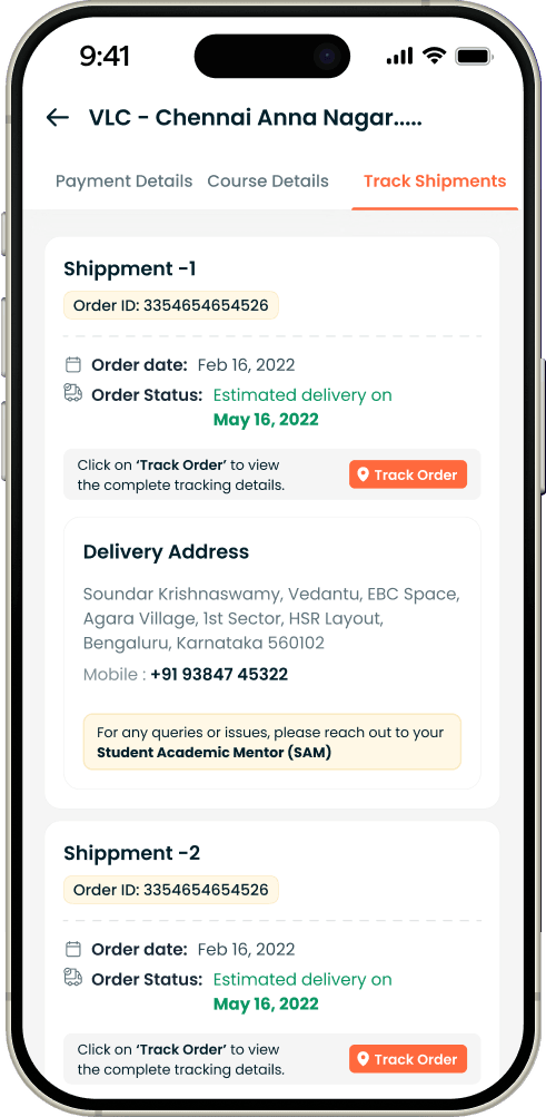
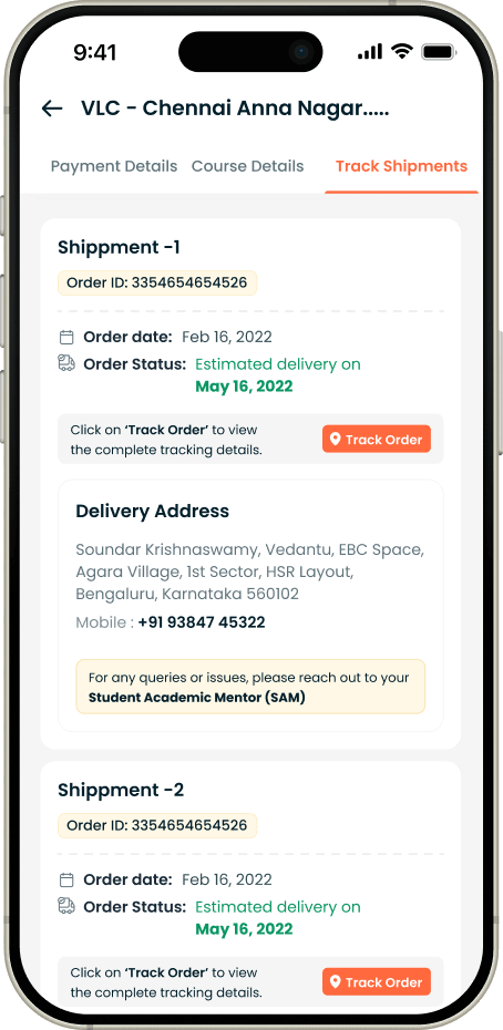
Track shipments
My wallet
Recharge Wallet
GBT change
Balance, recharge, history; pay-now for unpaid courses.
Grade
Board
Target
KYC
One form,every detailthe team needs
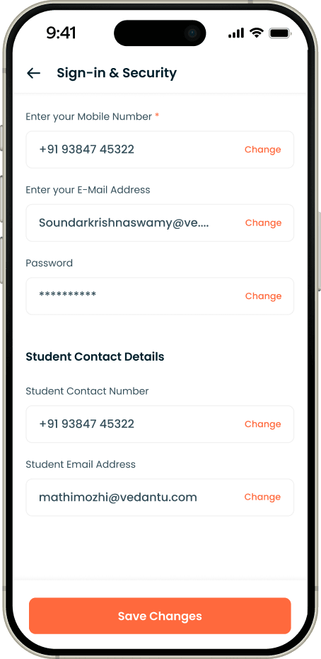
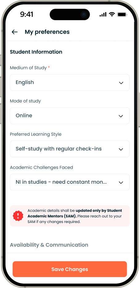
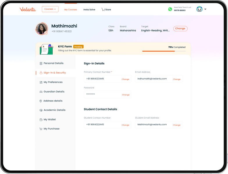
After launch, the profile still didn’t carry what the academic team actually needs to run a paid student’s year - blood group for camps, board marks for mentoring, who to call at 9pm. KYC adds 57 fields in six groups, inside the same profile structure, with a clear line between what a student edits and what only their Student Academic Mentor (SAM) can touch.
Free users
Every group is open. Students fill and edit all 57 fields within the validations; phone and email changes go through OTP.
Paid users
Preferences and Academic details are locked and shown in a disabled state - only the SAM can fill them. The KYC completion bar and % apply to paid accounts only.
SAM (via Tablesprint)
Sees every field, can change communication contacts without OTP, and owns the academic record. Completion % = new KYC fields filled ÷ total profile fields.
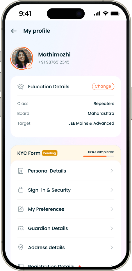
My profile · KYC
Sign-in & security
My preferences
My profile · KYC
My preferences
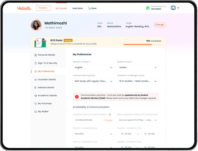
KYC is the profile’s “know your student” layer. Beyond the basics a student types at signup, it collects what the academic team needs to actually run their year - registration and centre details, personal details like blood group and category, previous-class marks and board, guardian contacts and address, and preferences such as availability and how parents want to be reached. It lives inside the same profile structure, group by group, so nothing is a separate form to chase.
User Stories & Edge Cases
The states that make a profile feelsafe to touch.
Changing a phone number
Adding or changing the student’s or the guardian’s - number triggers OTP verification every time, with the CTA adapting (add vs change) to the profile’s current state.
Too many attempts
Sensitive fields (name, phone, email) allow a single change, then route to a contact-support flow rather than failing blankly. A “request in progress” screen shows if the user retries.
Discarded edits
Edit a field then leave without saving → a “changes are not saved” toast, so nothing is lost silently and nothing is saved by accident.
Profile completion
A progress indicator scores 20 profile fields (5% each); a new user starts at 20% from mandatory signup data - nudging completion without forcing it.
Shared student / parent device
Up to 2 guardians, each verified by OTP; Guardian 1 can’t be removed; two guardian numbers can’t be identical - so a shared profile stays coherent.
Address & country logic
Pincode validates 4 - 10 digits; selecting India enables the Indian-state dropdown - small correctness details that keep data clean.
Rolled out
Scope, statedhonestly
This version covered students (teachers kept the existing flow). The PRD scoped Wallet & Purchases on web as redirects with deeper payment management deferred to V2, while the App/Mweb V1 user stories specified the fuller Wallet, Purchases and Bookmarks flows described above. The profile-update completion and drop-off metrics were defined and instrumented up front; this case study reports the goals it was built to move, not yet the post-launch results.
Lets talk
I design the data layer, not just thescreens
Designing for AI products. Open to conversations about product design.